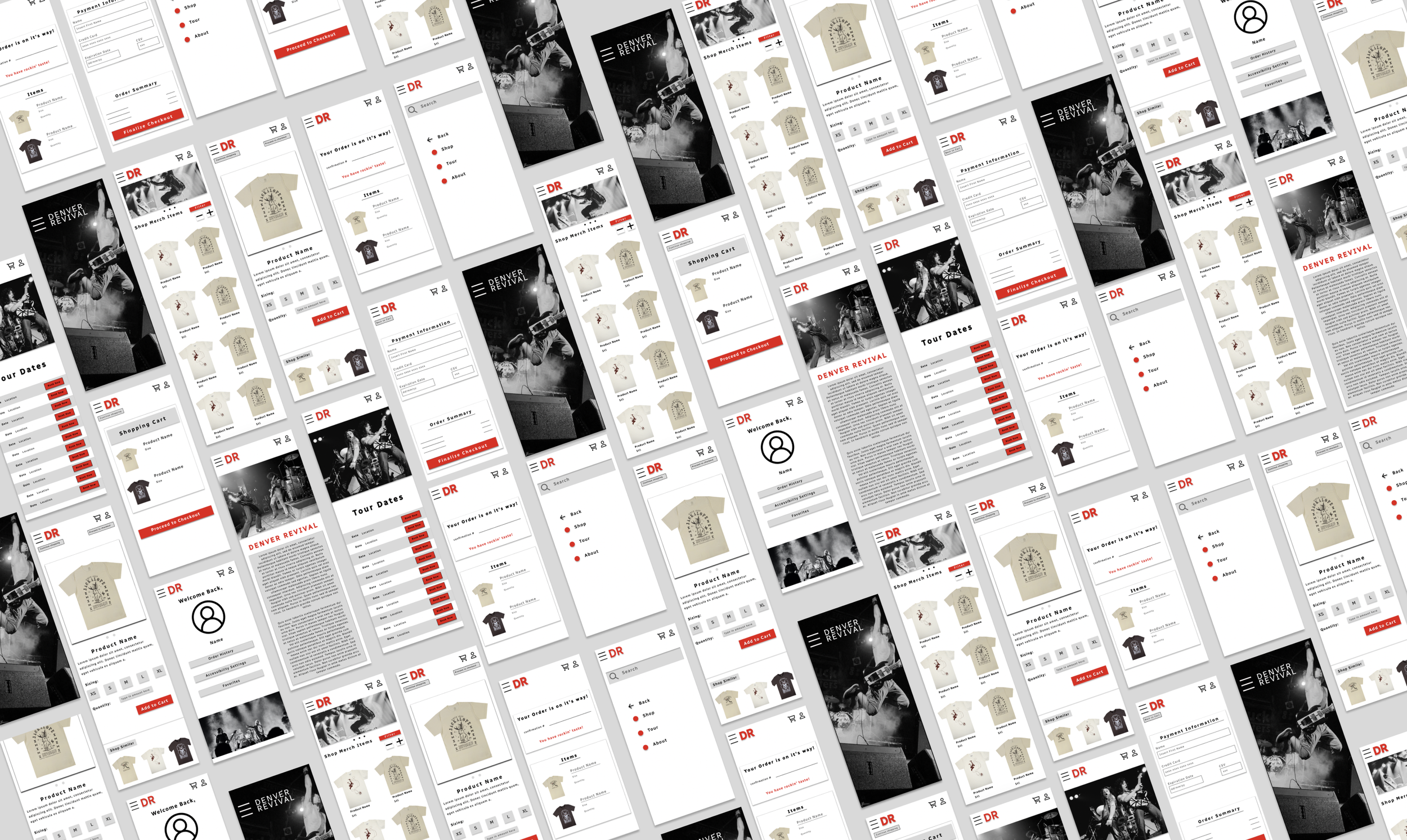
Denver Revival is a locally based musical ensemble hailing from Denver, Colorado. The band has been experiencing a rapid surge in popularity, necessitating the establishment of a merchandising platform to cater to their growing fan base. Committed to delivering exceptional music, captivating merchandise, and an overall remarkable concert experience, Denver Revival extends its appeal to a diverse demographic, targeting enthusiasts of all ages. Furthermore, their aspiration is to broaden their reach, propagating the essence of rock music to an even wider audience.
An issue arises for avid Denver Revival fans and individuals seeking to purchase merchandise on their behalf, as they lack access to a streamlined platform facilitating the convenient purchase of band merchandise.
Our rock band merchandise app will empower users to effortlessly peruse and purchase band-related products. This will have a substantial impact on both dedicated fans of the band and individuals seeking gifts for these fans. It will provide a user-friendly platform for seamless navigation, comprehensive product exploration, and convenient item selection.
Google Certificate Program Project - App Design
Date: July - August 2023
Role: UX designer designing an app for Denver Revival from conception to delivery.
Research:
I developed empathy maps as a foundational step to gain a comprehensive understanding of the target user demographics and their distinct needs. Through research, one of the primary user segments identified was the dedicated fanbase of Denver Revival, as well as individuals interested in acquiring band merchandise for gifting purposes.
This user group articulated the demand for an application that simplifies the process of purchasing merchandise, whether for wearing at concerts, as gifts, or personal acquisition. However, as we delved deeper into persona creation to refine our comprehension of user segments, additional issues emerged. These issues were primarily rooted in a lack of accessibility within merchandise apps, especially for users who may not possess a high level of familiarity with technology.
In conjunction with these efforts, we conducted rigorous competitive audits to gain insights from existing solutions within the market.
Starting the Design:
Paper Wireframes
Digital Wireframes:
Streamlined navigation emerged as a fundamental user requirement, necessitating a more accessible design approach. Ensuring ease of access, a prominent feature was introduced at the top of each page: a navigation bar facilitating direct access to various sections within the app, thus enabling seamless user navigation.
Throughout the iterative design process, I integrated user feedback and insights garnered from the research phase into the screen designs. To enhance user-friendliness, forward and back buttons were strategically incorporated to facilitate smooth app navigation. Notably, in response to user feedback highlighting the initial button sizes as too small, we subsequently implemented a larger button size in the design for improved usability.
Lo-Fi Prototype and Usability Study
Usability Study Parameters:
Study Type: Unmoderated
Location: US, Remote
Participants: 5
Duration: 10-20 minutes
Usability Study Findings:
I conducted two sequential rounds of usability studies to iteratively refine the design. The initial study's findings informed the transition from wireframes to mockups, while the second study employed a high-fidelity prototype to pinpoint areas within the mockups that required further refinement.
Findings from the first round highlighted the following key areas for enhancement:
Improved Navigation
Enhanced Order Customization Options
Streamlined and More Intuitive Checkout Process
The second round of usability testing yielded additional insights, including:
Overcrowding and Complexity in the Navigation Bar and Related Features
Ongoing Need for Refinement in the Checkout Process, Highlighting Persisting Confusion Among Users.
Mock-Ups and Hi-Fi Prototype:
Following the analysis of usability study results, it was determined that a significant portion of participants had expressed concerns regarding the button sizes, citing them as too small. In response to this feedback, a modification was made, exemplified by the expansion of button sizes. An illustrative instance of this adjustment is the enlargement of the filter and image size adjustment controls, thereby enhancing accessibility and usability.
Subsequent to the Usability studies, it became evident that users perceived the checkout process as overly rapid, resulting in a sense of confusion. Users expressed concerns regarding the limited opportunity for thorough review before finalizing their orders. Consequently, in our Mockup, we introduced enhanced and explicit indicators signifying the finality of the checkout step to address this issue.
Other Mock-ups:
Link to Hi-Fi Prototype: The high-fidelity prototype followed the same user flow as the low-fidelity prototype, including design changes made after the usability study.
Accessibility Considerations:
1. Our design palette predominantly consists of high-contrast colors, primarily black and white, complemented by a vibrant red hue. This deliberate color scheme selection enhances visibility and facilitates effortless identification of app elements, contributing to an improved user experience.
2. Incorporated multiple navigation options within the system, affording users the flexibility to proceed or backtrack within their user flow via various pathways.
3. Increased the size of our icons to allow for better readability.
Takeaways and Next Steps:
The application provides a comprehensive platform catering to individuals interested in procuring merchandise associated with Denver Revival.
One testimonial from peer feedback underscores this sentiment: "This app facilitated my long-awaited purchase of my favorite band's merchandise! The process was exceptionally smooth, and now I'm well-prepared with the perfect attire for their upcoming concert."
During the course of designing the Denver Revival Merchandising app, I gained a profound understanding that the initial design concepts and ideas represent merely the inception of the development process. Engaging in usability studies played a pivotal role in refining these concepts by providing critical insights into areas of the app that lacked user-friendliness. It's worth noting that this project marked my introduction into the field of User Experience (UX) design, offering invaluable learning experiences and growth opportunities.
Conduct another round of Usability studies to validate whether the pain points users have experienced have been effectively addressed.
Conduct more user research to determine any new areas of need.
Discuss with the band if there are any features they feel are missing within the app that they would like to be added in the next round of updates.


